Turo Dark Mode
Preface
This project was initiated in the summer of 2021. At the time, our fledgling design systems team at Turo didn't have engineers yet, so we decided to do most of the design and systems thinking up front to be ready for when they would eventually join the team later in August. The crux of the project was really shifting the implementation of color across the product to semantic color tokens defined by the color system — this in turn would enable color theming and dark mode.
Credits
Role: Product Designer, Design Systems Web Development: Gannon Curran iOS Development: Dan Hendricks Android Development: Francisco Velasquez Brand Design: Samantha Hensley, Carolyn Pulvino
Meta
3/8/2022
This project was one of the first major initiatives we took on as a newly formed design systems team within Turo. The process was threefold:
- Expanding our existing color system while defining semantic color variables (design tokens)
- Migrating them back into our native applications for Android and iOS
- Documenting everything for the rest of the product development organization to understand and use
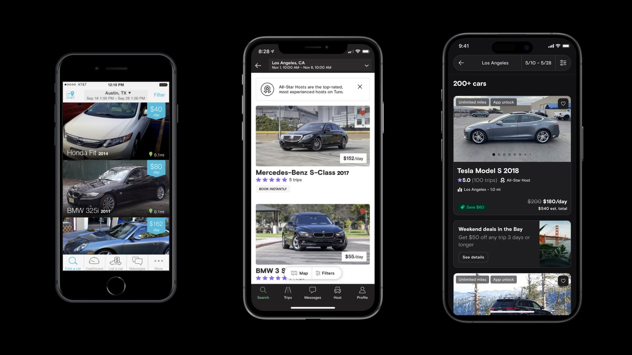
The tip of the iceberg
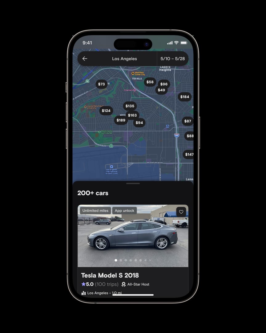
Roughly 50% of our active users were using the dark mode feature in their device's system settings, yet by that point, our apps only supported a light theme. The real challenge was under the hood: the colors used in each platform were implemented inconsistently and often hardcoded. This project sought to address this shortcoming while improving the infrastructure of our product.
A couple years before I joined the company in 2018, Turo had just undergone a huge rebrand from RelayRides. By all accounts it was a company-wide effort and required all-hands-on-deck to change the face of the product. Not long before I transitioned from the brand design team to design systems, we once again executed a slight brand refresh, changing up our brand colors for a second time. I witnessed first-hand how much technical debt stood in the way of making such sweeping visual changes to the entire surface area of our apps, and it was then that I truly understood the value of moving to a token-based color system.
Challenges
After a thorough audit of the entire surface area of the product, several challenges were identified:
- Design debt — our first iteration of semantic colors from the brand refresh didn't account for dark mode and wasn't designed as a true "light mode" theme.
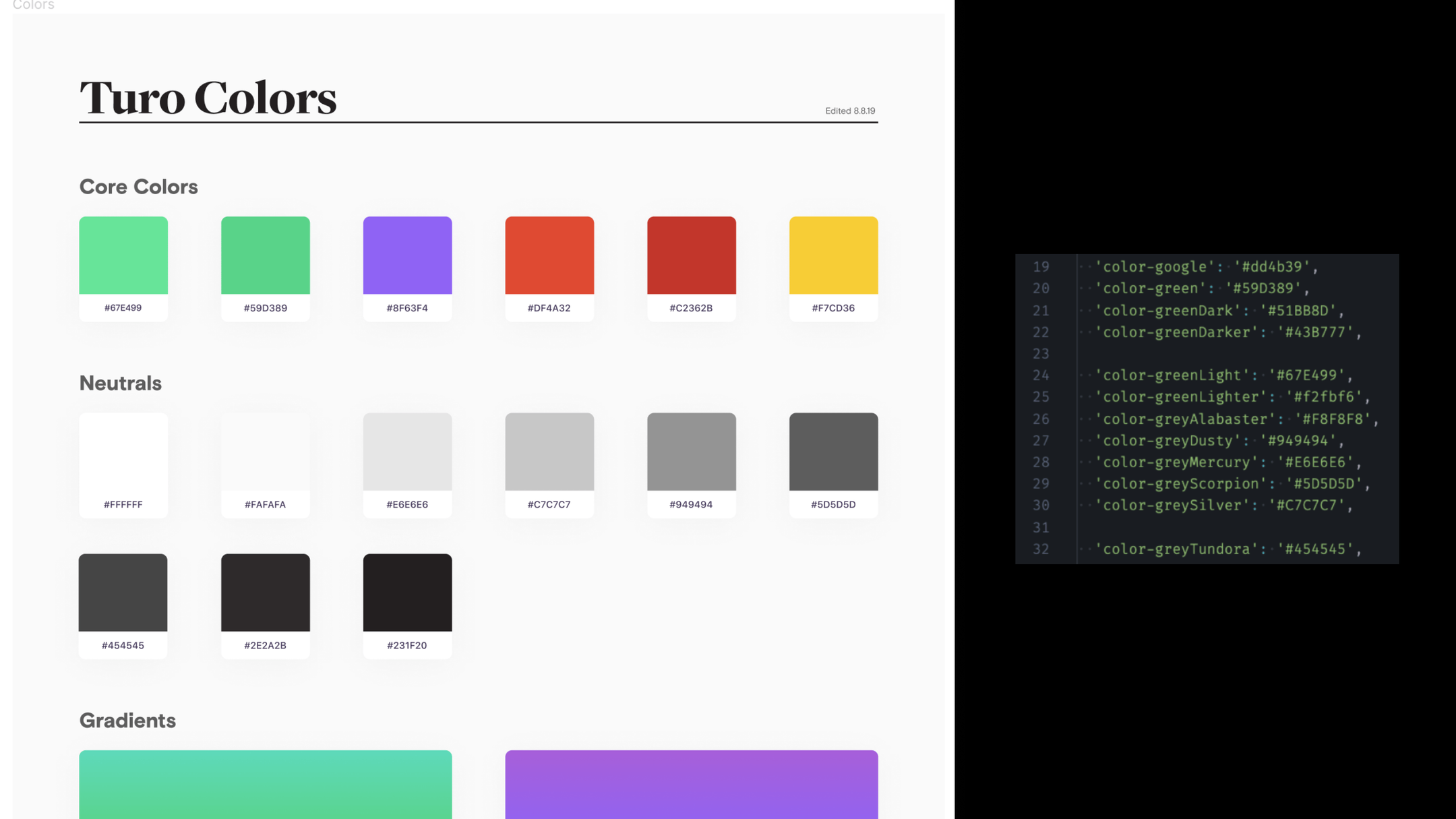
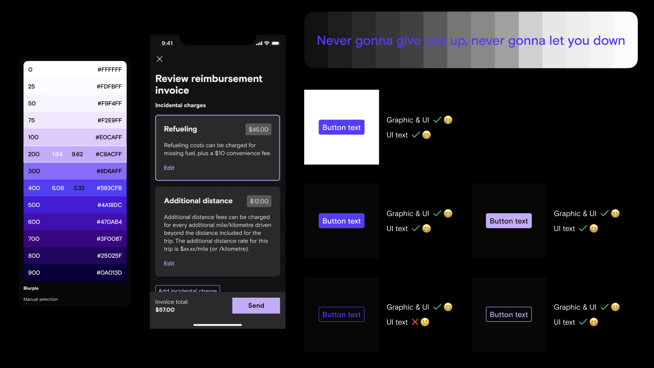
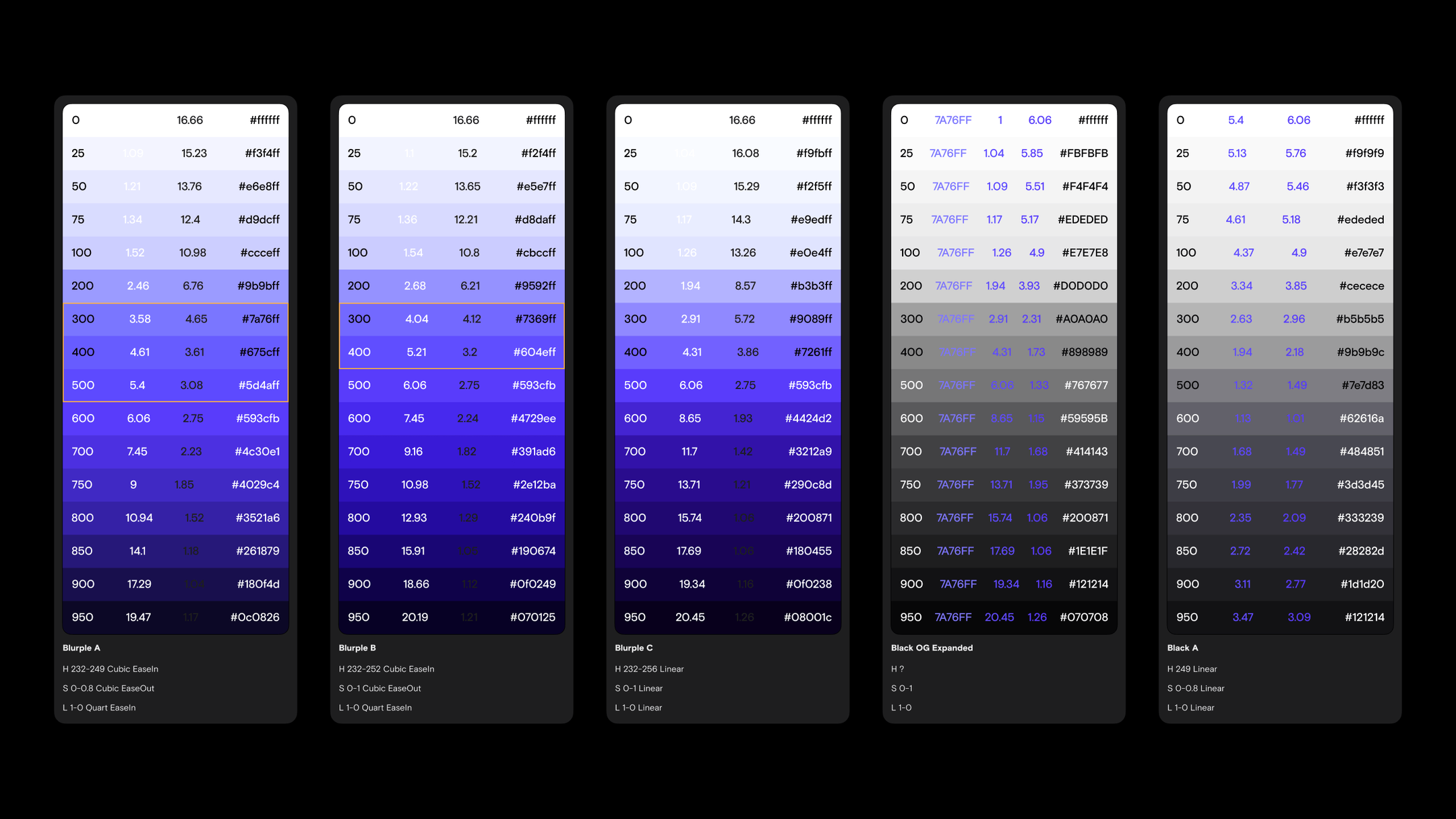
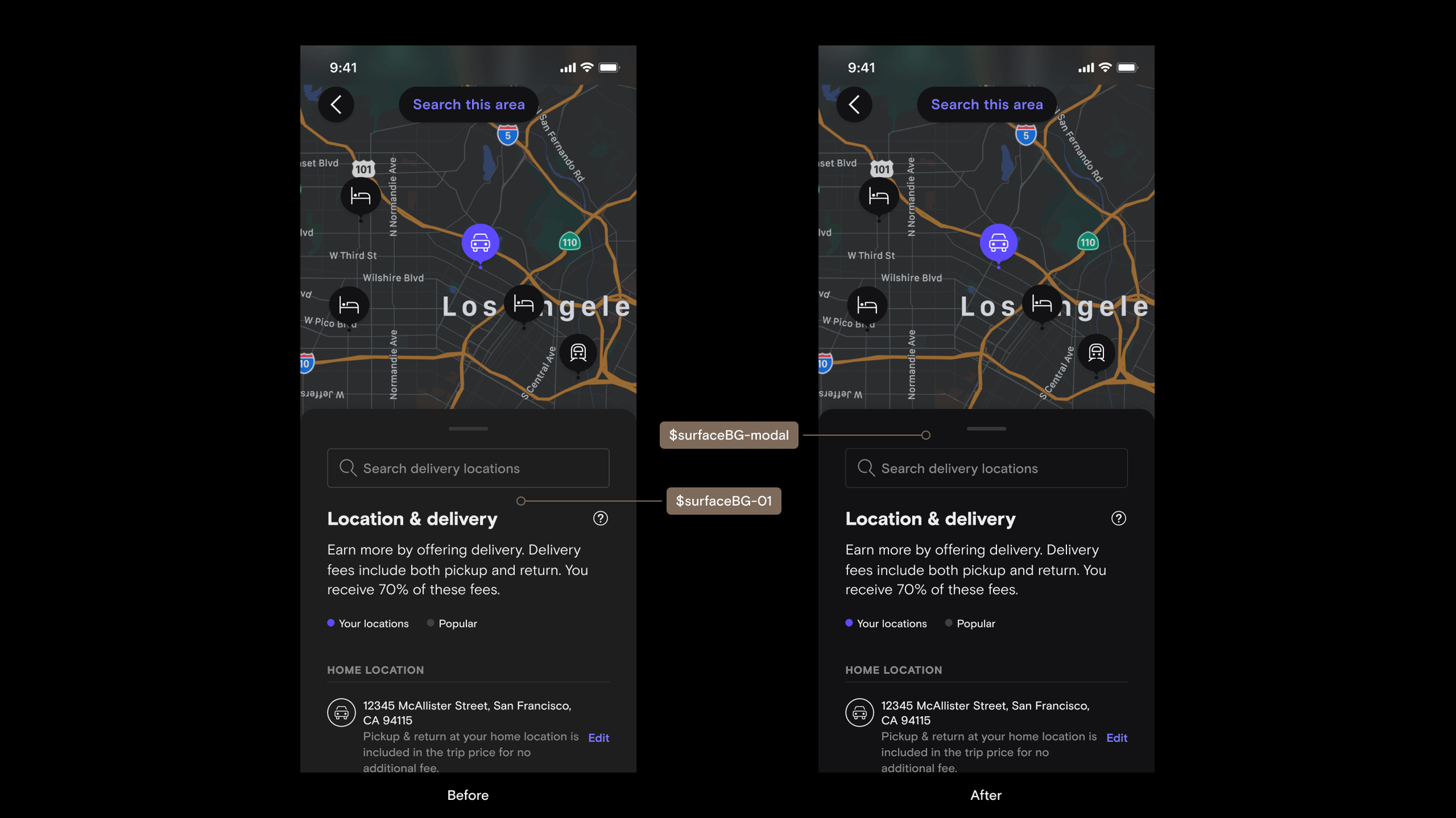
- Maintaining our post-refresh brand color "blurple" — we moved away from using green as a brand accent color to reserve it for a more meaningful communication of status in the UI, but our new primary and interactive color "blurple" had a lightness value of 61. Stripping away the saturation, it was similar to a mid-gray and therefore was barely accessible on top of other dark grays.
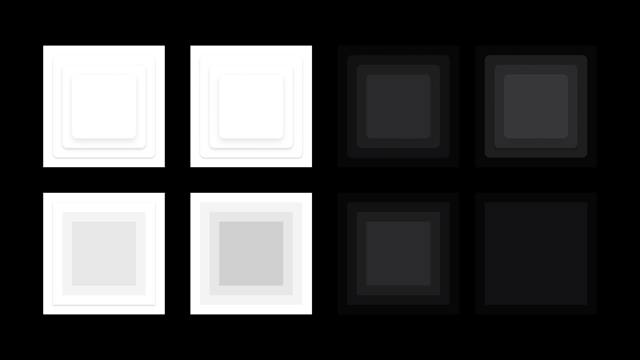
- Surface colors and elevation — our existing scales weren't nuanced enough on the darker end, leaving us with dark surface colors that were too far apart. This made it tricky to replicate elevation styles from light mode and keep "blurple" accessible.
- Icons and illustrations — we revamped our icon system so thankfully it was primed for theming, but we had a large amount of legacy icons and illustrations still lingering in the product that needed to be removed or recolored.
Special shout out to our brand design team for their support in recoloring icon and illustration assets for this initiative.
Discovery and exploration
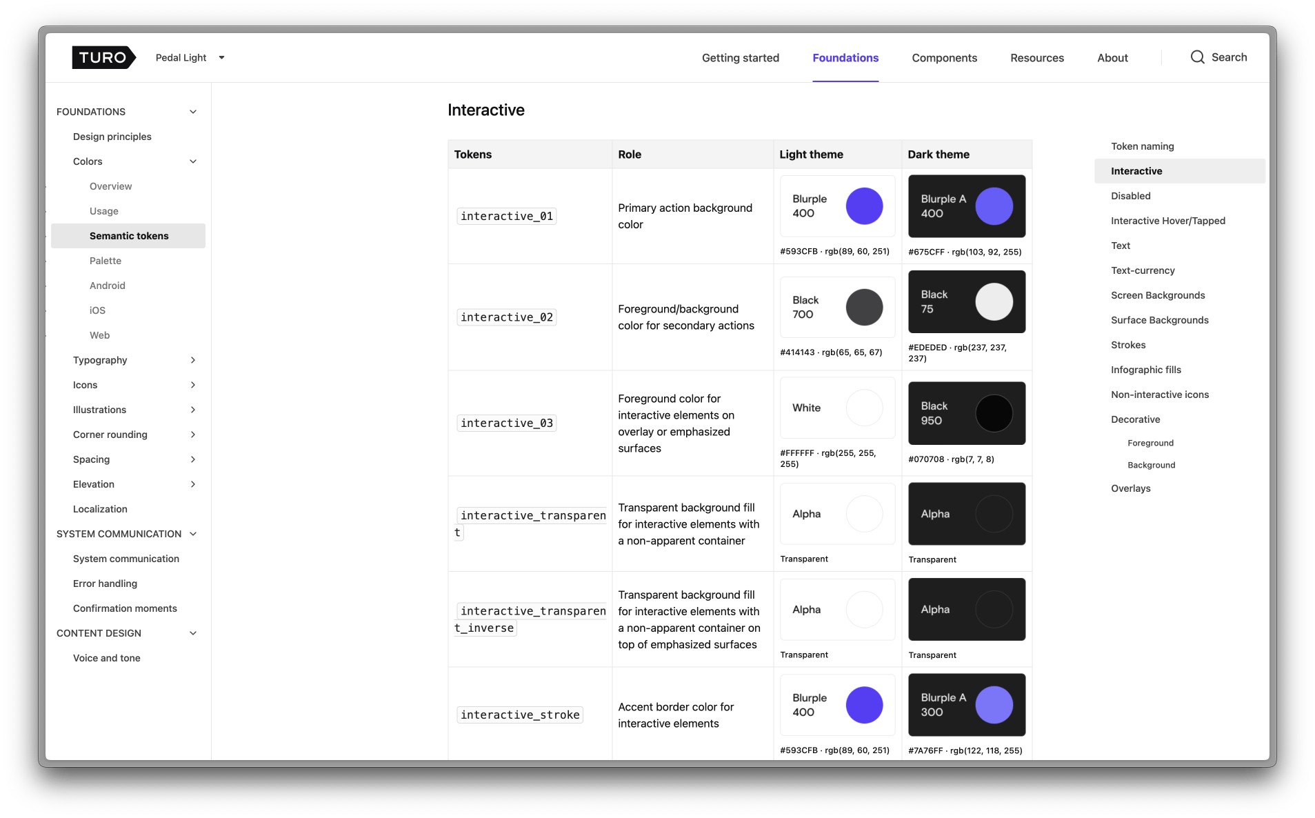
A lot of the initial discovery and research involved analyzing our color scales, proposing new ones, testing for color contrast and perception with different color combinations, and defining new semantic roles for each color variable to support two themes.
Documenting everything
A crucial piece to this whole puzzle was writing clear documentation of our new semantic color system that both engineers and designers could reference to understand how to use it intentionally. Colors should have clear meaning in the product, and using our tokens appropriately would ensure sufficient contrast ratios for our users.